Images & video
Feature Showcase
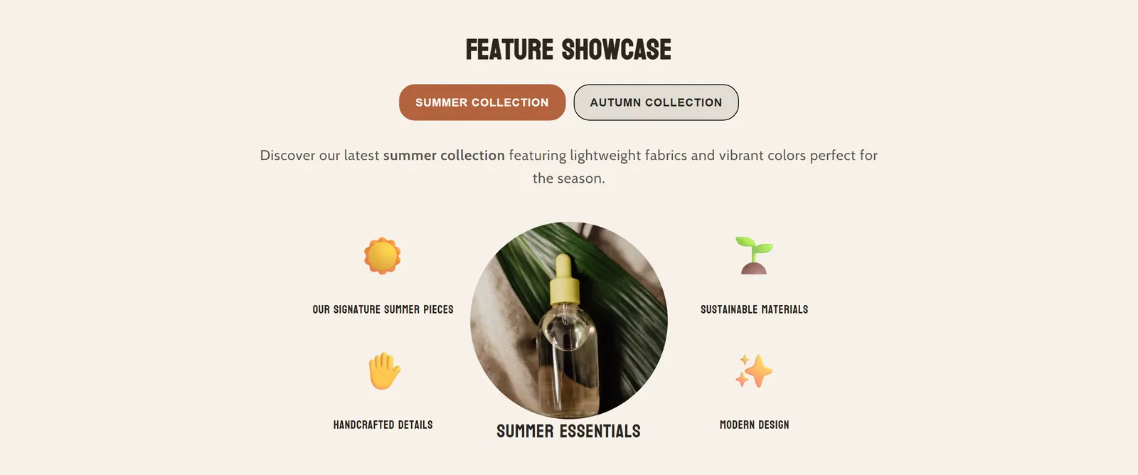
What it is
Shows features in tabs. Each tab has a main image or video surrounded by four side images with their text.
When to use it
- Present several collections or categories with their strengths in a single section.
- Show product details from several angles with small images and captions.
- Use emojis instead of images for a light visual touch.
- Used by default in
- Not placed by default: add it from the editor.
- Available in
- Any template
- Appears in the editor as
- «Feature Showcase»
Main settings
How this section's settings are organised.
General15 settings
Disable tabs · Heading · Font size · Mobile font size · and 11 more
Image Settings3 settings
Side Image Width · Emoji Size · Main Image Width
Spacing Settings2 settings
Gap Between Columns · Gap Between Side Items
Mobile Settings5 settings
Mobile Layout · Mobile Tabs Layout · Mobile Side Image Width · Emoji Size · and 1 more
Mobile Spacing4 settings
Mobile Gap Between Columns · Mobile Gap Between Side Items · Gap Between Caption and Image · Image Border Radius (set to 500 for circles)
Colors11 settings
Override section colors · Section Background · Description Color · Override tab colors · and 7 more
Common settings
This section also has these shared settings, explained on their own page:
Blocks
Content you add inside the section with “Add block”. Their settings are in the full reference.
- Feature Tab18 settings
Full reference: 71 settings
Type, default value, ranges and units, every option and when each setting shows — plus every block setting, tips and the docs of older versions. Available to Pixelion customers.
File: sections/feature-showcase.liquid · v2.0.15