Footer
Footer
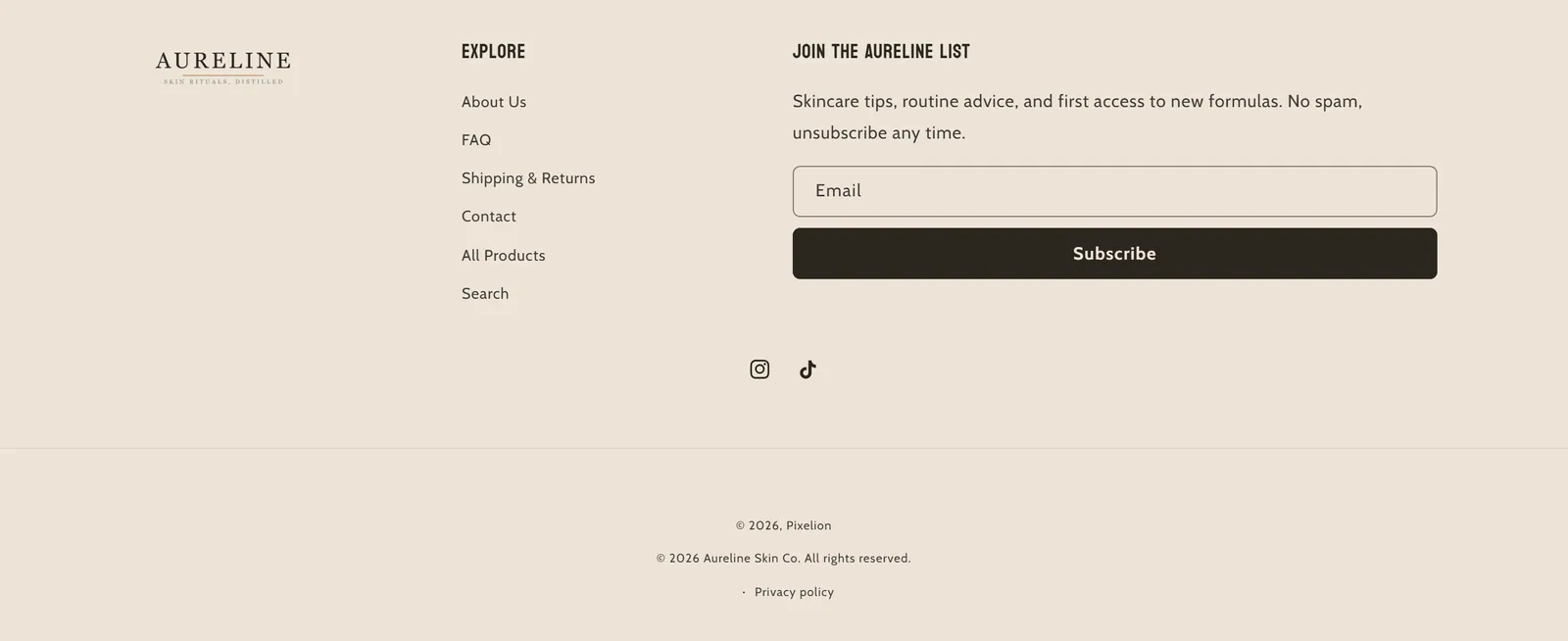
What it is
The store's footer, made of content columns and a bottom bar with social media, selectors, payment methods and policy links.
When to use it
- Offer quick-link menus, brand information and contact details.
- Invite visitors to subscribe to your emails.
- Show the accepted payment methods and the country or language selectors.
- Used by default in
- Footer (every page)
- Available in
- Any template
- Limits
- Accepts app blocks
Main settings
How this section's settings are organised.
General1 settings
Color scheme
Follow on Shop1 settings
Enable Follow on Shop
Country/region selector1 settings
Enable country/region selector
Language selector1 settings
Enable language selector
Payment methods2 settings
Show payment icons · Custom payment icons to show
Policy links1 settings
Show policy links
Branding1 settings
Branding text
Spacing1 settings
Top margin
Common settings
This section also has these shared settings, explained on their own page:
Blocks
Content you add inside the section with “Add block”. Their settings are in the full reference.
- Menu4 settings
- Brand information3 settings
- Text4 settings
- Image6 settings
- Email signup7 settings
- Featured product7 settings
- Featured collection7 settings
Full reference: 50 settings
Type, default value, ranges and units, every option and when each setting shows — plus every block setting, tips and the docs of older versions. Available to Pixelion customers.
File: sections/footer.liquid · v2.0.15