Conversion & urgency
Step Instructions
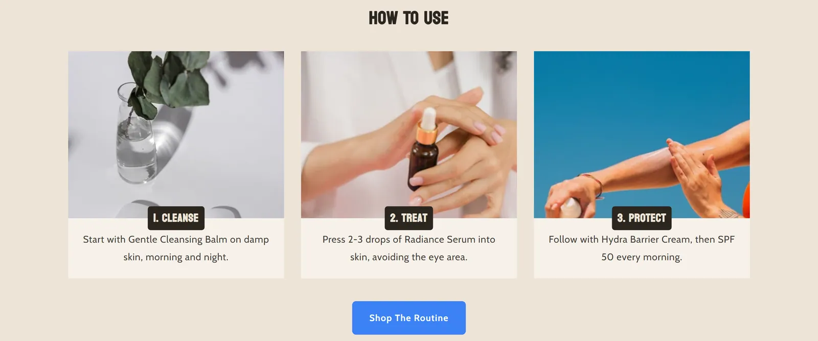
What it is
Shows a series of numbered steps, each with an image, a title and a description, in a grid or a slider. It is meant to explain how to use a product.
When to use it
- Explain step by step how to use, assemble or prepare a product.
- Show the purchase or delivery process visually.
- Present a ritual or care routine with one image per step.
- Used by default in
- Product page
- Available in
- Any template
- Appears in the editor as
- «Step Instructions V2»
Main settings
How this section's settings are organised.
Layout Options5 settings
Columns on desktop · Use slider layout · Show pagination · Enable autoplay · and 1 more
Slider Settings6 settings
Arrow background · Arrow color · Arrow border radius · Arrow width · and 2 more
Card Design3 settings
Content position · Content padding Y · Content padding X
Border6 settings
Border · Override border color · Border color · Border width · and 2 more
Image Settings2 settings
Image ratio · Lazy load images
Step Number8 settings
Show step number · Size · Font size · Border radius · and 4 more
Step Title8 settings
Font size · Override text color · Text color · Border radius · and 4 more
Step Description3 settings
Font size · Override text color · Text color
Section Colors3 settings
Section color scheme · Override background color · Background color
Section Spacing6 settings
Padding top · Padding bottom · Margin top · Margin top (mobile) · and 2 more
Blocks
Content you add inside the section with “Add block”. Their settings are in the full reference.
- Step3 settings
- Pixelion Heading24 settings
- Pixelion - Rating stars49 settings
Full reference: 173 settings
Type, default value, ranges and units, every option and when each setting shows — plus every block setting, tips and the docs of older versions. Available to Pixelion customers.
File: sections/step-instructions-v2.liquid · v2.0.15